Indie Diary #8 — Giving watchOS the love it deserves
In the last few weeks, I’ve started a “big rebuilding” for Padlok. The goal is to refine the first user experience right after the app was installed, bring more SwiftUI and love to the overall UI, rework the brand identity, and bring both more modern code architecture approaches, as well as Swift 6 strict concurrency, to the codebase.
Therefore, this brought me to rebuilding the core bricks of the app, and gave me the time to re-think entirely the watchOS app experience, mostly thanks to watchOS 10’s new design language that makes a lot of sense for Padlok.
Padlok
Still looking for the codes?
A long-forgotten watchOS app
When I started building Padlok, back in 2020, I didn’t expect to build a watchOS app for the first version. Therefore, I discovered that supporting custom notifications on watchOS required me to build an associated app.
This is why I built a “quick and dirty” SwiftUI watchOS app that has basically remained unchanged since its release.
It was long overdue that I start rebuilding a more modern and capable extension of Padlok, adapted for the wrist.
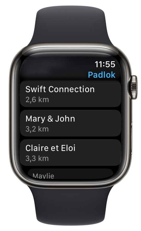
Bring the colors in!
When Padlok launched, address customization was not available. Therefore, it’s expected that watchOS shipped without any, and never caught up!
With watchOS 10 release, Apple went for a colorful approach for apps, with a new color background language. It was the perfect timing to bring this as a core feature of the redesign.
Before
The addresses list was a bit sad and colorless
After
Colorful, with glyphs. Finding an address is easier
The list is not the only screen that gets the advantage of coloring. The address details also got more WatchOS 10-like features.
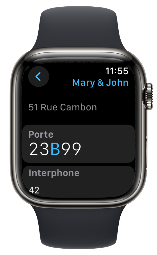
Before
A sad, but functional approach to giving address info
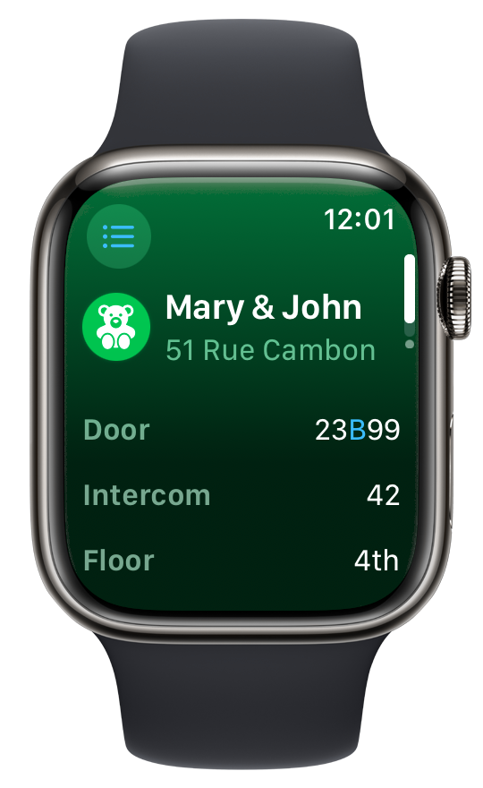
After
Colorful, and more organized address info screen
Map and relevant actions
Another watchOS 10 new feature is sectioned vertical pagination a screen can bring. This allows to distinctly separate relevant information while keeping ease of access thanks to the digital crown scroll.
For Padlok, I brought two new screens:
- A nearby map, that’ll also show your current position.
- An action sheet, showing a Share Button, and when a phone number is available, a call button as well.
First section
Address info
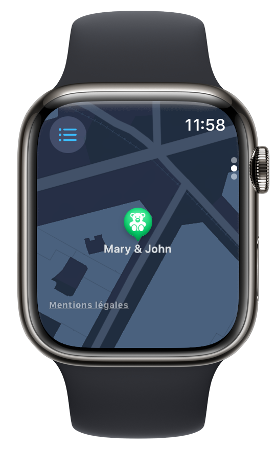
Second section
Nearby map
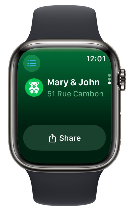
Last section
Action sheet
Those new screens bring more capabilities to the watch app, while keeping it straight to the point, and without overloading it with polluting feature buttons.
Going straight to the point when the app is launched
When opening Padlok, the first thing the app presented was an address list, sorted by distance. Starting with watchOS 10, the Human Interface Guidelines recommend “proactively anticipating people’s needs and using on-device data to provide actionable content that’s relevant in the moment or very soon.”
For Padlok, it means to open immediately the nearest address if it’s close enough, just like the weather app would open the current location forecast.
Before, right after launch
A raw list of addresses
After, right after launch
As no addresses are nearby, the colorful list is shown by default
After, right after launch
As Mary & John address is close enough, the details views shows automatically
Release timeline
Although all those changes are compatible with iOS 17, watchOS 10, and Swift 5.10, I think it’s probable that I will consider waiting for iOS 18 and watchOS 11’s release date to ship all the Padlok improvements I have in store. This timeline gives me a bit more time to prepare the rest of the app to integrate with my new design language and ensure that it’s more integrated with new Apple OSes’ features.
In the meantime, I’ve also started working on another app. If my motivation allows me, I’ll try to ship it for Ship-a-ton
I’m really satisfied with how this redesign went. But I’m also very happy with the new code and architecture I’ve brought to power them and allowing me to move quicker into the revamp of my interfaces.
I’ll write about this migration process later. In the meantime, I’ve got a lot of work to achieve!
Padlok
Still looking for the codes?
Don’t miss a thing!
Don't miss any of my indie dev stories, app updates, or upcoming creations!
Stay in the loop and be the first to experience my apps, betas and stories of my indie journey.