Indie Diary #6 — Building a new app
At the end of last December, I came with an idea.
I use Siri a lot for my connected home. Turn on this room, turn off this other… Sadly, I stopped counting when it didn’t worked as expected.
What if I brought latest LLM with HomeKit together?
An encouraging proof-of-concept
About two days later, after exploring different LLM, and HomeKit documentations, I had a first initial version of what would later become Omee.
This very first version was capable of fetching specific types of data within the app, and performing very simple updates. About no UI existed at this moment, simply a TextField, and debug output in the console, as well as very naive way to communicate with HomeKit API.
The app was a mess, and the initial algorithm was coded within the iOS code itself instead of being delegated to a server. That means that the OpenAI secret key was within the app, doing the exact opposite of what I described a few days earlier in a previous story. Leading me to acknowledge that some kind of back-end API would be required to power the app.
Up to this point, I know the following:
- The concept works with rough edges, that can be improved with iterations
- This app would be a challenge in term of UI, specifically for all the types of HomeKit accessories to support.
- It would be hard, if not almost impossible to test other cases than my home
- A backend API, and some sort of authentication will be required to make my LLM requests happen.
- Time is limited to build this kind of app, rumors being that Siri would greatly improve with iOS 18.
- This app would be far more work than I ever accomplished, with very limited time
- It’s feasible
Challenge accepted!
As you figured, I knew from the start that this kind of app would be like running two races at the same time:
- Building a powerful backend engine to deal with the requests
- Building a nice UI and UX to deal with both the requests and results
Moving the current engine logic from the app to the backend was the first thing I did with modern code architecture. This, because I find it easier to build an API than an app, because the API is abstract and does not have to deal with humans.
Also, it’s the perfect time to define interfaces between the app and the server. I need the app to send me some kind of representation of the home. Then I need the server to answer with what the app need to perform. This got me into agreed some kind of contract between the interfaces.
Then, I knew very early that this kind of app would only become possible if I made the right architecture choices from the start. A HomeKit based application means that there are a lot of scenarios that will be very difficult to reproduce. So I came up with different key rules to build the app:
- I need to implement some kind of playground in the backend. Feed it with any home representation and a request, and I should get what the LLM ask the app to perform, with some debug info
- I need to make my app architecture SwiftUI Preview based. Every part or subpart of the app should have some previews capabilities, mocking whatever Previews cannot gives me, like a home filled with any kind of accessories.
The Preview-based architecture
After a very quick experimentation, I found my magic recipe for mocking any kind of dependencies in my app: SwiftUI Environment coupled with protocol. It forces me to really extract the very least of the interaction between the views and the dependency, describe it in a protocol, and inject it as an environment value.
The default value for the environment is the live implementation, using the external APIs (like HomeKit). But I can inject preview objects, that are mocking the behaviors and setup the views to reflect an entirely artificial state.
I used this architecture in the whole application so far, and it allowed me to mock almost every aspect of this that I would not be able to easily test otherwise. This architecture choice allowed me to make in a few hours what would be days of work otherwise.
I’ll write a story about this architecture in the next few days.
User interface and experience
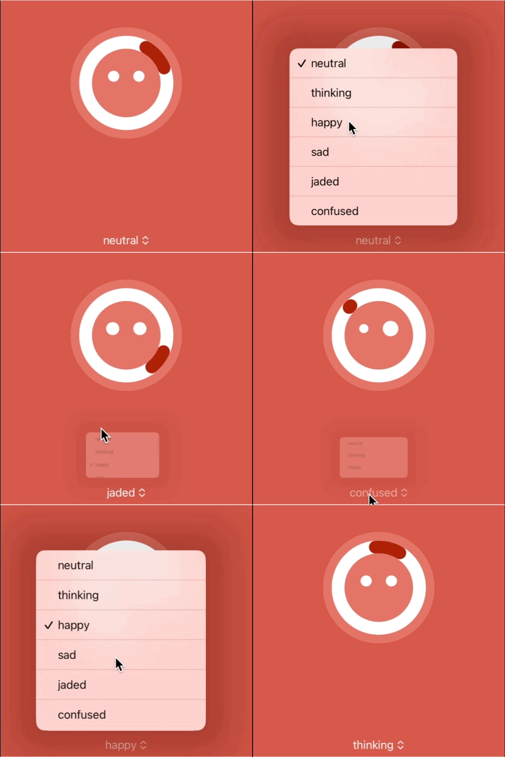
Like we SharePal, my fiance was responsible for giving an identity and a look to the overall app. And after a lot of iteration to build the Omee character, she found that using a deterministic progress indicator as a face would not only be cute, but could also serve as some kind of indicator. That evening, I had tremendous amount of work do on every part of the app. That’s why I spent my entire evening animating her design instead, using SwiftUI magic and previews.
Seeing Omee alive for the first time, going from an emotion to another really gave us the feeling that we were getting somewhere, giving birth to the personality of the app.

Some of the available emotions, in a SwiftUI preview
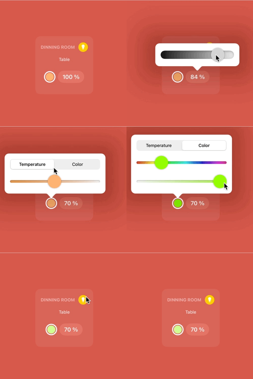
Another key moment for the app came with another idea that increased the complexity of the app even further. Querying the app is good. But what if the result screen was interactive? I ask for turning on some lights, but then I change my mind and turn off a few, and tweak the luminosity right from there.

Example of direct lightbulb interactivity
This idea gave Omee an even better approach of the smart home. You can query, but you keep control of what happen, and have the ability to correct it when it’s doing things wrong. And creating a scene would become even more intuitive, because you’d be able to “fix and tweak it” before saving it. In the current beta, tweaking the created scene is not yet possible.
The complexity this interactivity added to the initial implementation has not yet been solved. I’m aware that I might rethink the way I communicate with HomeKit from the ground up because of this. This will also be the perfect moment for me to try to fix other issues I have with the app, like the fact that I don’t yet support accessories that have been grouped together. HomeKit hides so much complexity that I’m gradually winding down.
Finally, this is an app that is perfectly fitted for a full VoiceOver experience. I’ve always been very sensitive to accessibility topics. But for this app, I want to raise the goal even further, and make it an incredible voice-only experience. This, of course, will also bring a lot of UX challenge, specifically for the interactivity of the results.
Wasn’t that a bit too ambitious?
Yes! I think it was.
Omee turned out to be way more complex than I thought it would be. But the complexity is because we’ve kept increasing the complexity by adding more advance usages to it.
Those improvements is what makes the app valuable. It really does make a difference, because I felt it the day I added those features in the app. Therefore I’m not regretting those addition, and I’ll work hard to make sure they turn out to be reliable enough for an app launch.
Was it reasonable to go deep into that much complexity? Fair question. I’ve no idea on how much the app would perform on the store. HomeKit is pretty niche, and because I cannot replace Siri as the default voice manager, it’s not as straightforward to invoke Omee, and replace Siri.
But I do think there are potential. I started experimenting Shortcut and Action button integration, giving a quicker access and a powerful automation tool to your home. I’ll also look on how much I can also rely on other system entry points like widgets.
Also, it’s the curiosity of looking on how we can interact with our home differently than we used to. I found out that having something that create a draft of a scene to iterate on is quite useful, instead of building it from the ground up with the advanced interface within the Home app. And maybe this is all Omee needs to be, some kind of assistant to help you configure a better connected home.
I have other ambitious plans to make Omee grow even bigger. From more HomeKit integration (like triggers), to maybe other Home standards, and/or domains. Everything is on the table, as long as this cute little guy please some folks.
But this ambition come with a cost. I might have to lower the number of apps I’ll build this year. Again, not like I’m regretting this, as building Omee really is a fun process where I solved a lot of problems of my past.
If you’re thrilled about Omee, it’s currently available in open beta on TestFlight, with limited seats available. Check later if you can’t get in, as I’ll add more seats every few days. The goal of this beta is to iterate on the engine with more different home setups, and also to refine the application UX until it’s reliable enough to be shipped on the Store, probably before the end of this month.
Don’t miss a thing!
Don't miss any of my indie dev stories, app updates, or upcoming creations!
Stay in the loop and be the first to experience my apps, betas and stories of my indie journey.