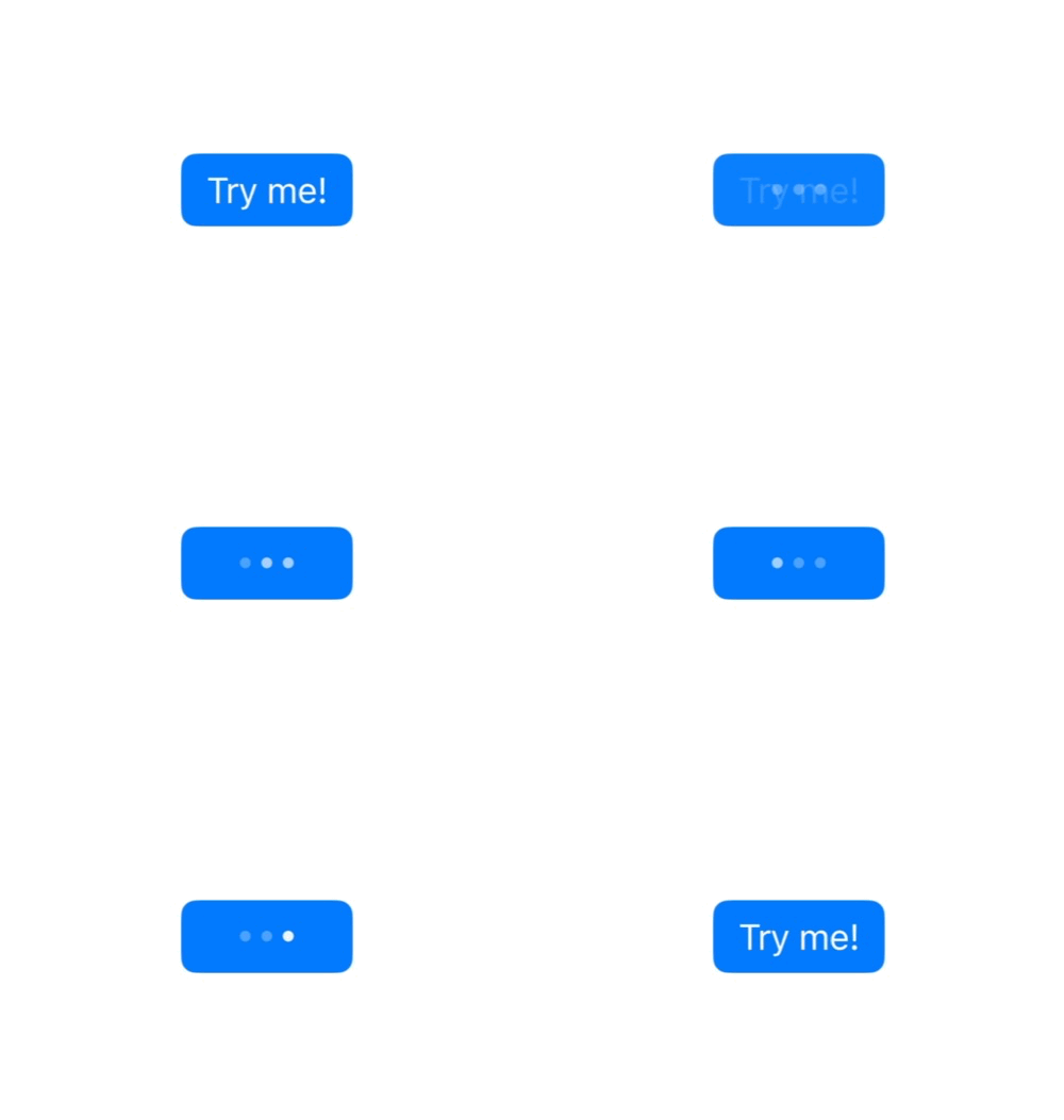
Asynchronous SwiftUI buttons
SwiftUI buttons are an example of what I would call an awesome and straight-to-the-point API: you describe a button and have a closure when it’s pressed!
Because I needed it, I built ButtonKit, a Swift Package that supports both asynchronous and throwable closures for SwiftUI Button.
Let me tell you the story of why (and how) I built it.
Modern Swift code is all about async
Swift concurrency was launched 2 years ago. And now, the plain “old” Button seems a bit outdated because I end up building a lot of those in my massive views.
Button {
    Task {
        guard !isLoading else {
            return
        }
        isLoading = true
        try await doSomething()
        isLoading = false
    }
} label {
    if isLoading {
        ProgressIndicator()
    } else {
        Text("Press me!")
    }
}
This approach “works”, but there is plenty of room for improvements:
- The view that contains it needs to keep track of the loading state for each button.
- All of those “isLoading” checks are a turn-off for me.
- What if we need to cancel the task?
Wouldn’t it be nice if we had a better Button implementation that would give us loading and failing behaviors for free?
Like this:
AsyncButton {
    try await doSomething()
} label {
    Text("Press me!")
}
Make a nice wrap
SwiftUI is all about small, composable, and reusable views, right? It would be nice to have this logic wrapped in a view of its own, so let’s go this way:
struct AsyncButton<S: View>: View {
    private let action: () async -> Void
    private let label: S

    @State private var isLoading = false

    var body: some View {
        Button {
            Task {
                guard !isLoading else {
                    return
                }
                isLoading = true
                await action()
                isLoading = false
            }
        } label: {
            if isLoading {
                ProgressView()
            } else {
                label
            }
        }
        .allowsHitTesting(task == nil)
    }

    init(action: () async -> Void, @ViewBuilder label: @escaping () -> S) {
        self.action = action
        self.label = label()
    }
}
It is a bit better, but it turns out it’s even better to keep track of the task instead of the loading state, allowing more flexibility in the future, like cancellation.
struct AsyncButton<S: View>: View {
    private let action: () async -> Void
    private let label: S

    @State private var task: Task<Void, Never>?

    var body: some View {
        Button {
            guard task == nil else {
                return
            }
            task = Task {
                await action()
                task = nil
            }
        } label: {
            if task != nil {
                ProgressView()
            } else {
                label
            }
        }
    }

    init(action: () async -> Void, @ViewBuilder label: @escaping () -> S) {
        self.action = action
        self.label = label()
    }
}
Keeping track of that task can provide us with access to some kind of cancellation mechanism. But how should we expose it, and how can we make this button even more customizable?
SwiftUI API is the best source of inspiration
Digging into SwiftUI, what we get from Apple to customize Button behavior are ButtonStyle and PrimitiveButtonStyle.
They are mutually exclusive but bring a different set of features:
ButtonStylegives you the pressed state, the role, and the label.PrimitiveButtonStylegives you the role, the label, and a method that triggers the button action!
Using this approach, we can build an AsyncButtonStyle protocol, giving us the opportunity to override the look and feel of our button according to the loading state and even giving us a cancel method to work with.
Building this pattern doesn’t seem simple at first glance, but thankfully, there is always a SwiftUI Lab article about these advanced topics!
This is how I ended up creating my own protocol:
public protocol AsyncButtonStyle {
    associatedtype Label: View
    associatedtype Button: View
    typealias LabelConfiguration = AsyncButtonStyleLabelConfiguration
    typealias ButtonConfiguration = AsyncButtonStyleButtonConfiguration

    @ViewBuilder func makeLabel(configuration: LabelConfiguration) -> Label
    @ViewBuilder func makeButton(configuration: ButtonConfiguration) -> Button
}

public struct AsyncButtonStyleLabelConfiguration {
    typealias Label = AnyView

    let isLoading: Bool
    let label: Label
    let cancel: () -> Void
}

public struct AsyncButtonStyleButtonConfiguration {
    typealias Button = AnyView

    let isLoading: Bool
    let button: Button
    let cancel: () -> Void
}
I’m using two “make” methods because I’m not replacing either PrimaryButtonStyle or ButtonStyle.
This allows us to compose the loading behavior with standard buttons like .borderedProminent, as sometimes we need to modify the label inside the button, and other times we need to apply something to the entire constructed button.
Passing this style to the view is relatively simple, involving SwiftUI environment key/value and a bit of type erasure. You can find the implementation details in the ButtonKit source code.
Now, creating a custom loading style is very straightforward, just like creating a new ButtonStyle:
struct EllipsisAsyncButtonStyle: AsyncButtonStyle {
    @State private var animated = false

    func makeLabel(configuration: LabelConfiguration) -> some View {
        configuration.label
            .opacity(configuration.isLoading ? 0 : 1)
            .overlay {
                Image(systemName: "ellipsis")
                    .symbolEffect(.variableColor.iterative.dimInactiveLayers, options: .repeating, value: configuration.isLoading)
                    .font(.title)
                    .opacity(configuration.isLoading ? 1 : 0)
            }
            .animation(.default, value: configuration.isLoading)
    }

    // Facultative, as ButtonKit comes with a default implementation for both.
    func makeButton(configuration: ButtonConfiguration) -> some View {
        configuration.button
    }
}

extension AsyncButtonStyle where Self == EllipsisAsyncButtonStyle {
    static var ellipsis: EllipsisAsyncButtonStyle {
        EllipsisAsyncButtonStyle()
    }
}

#Preview {
    AsyncButton {
        try await Task.sleep(for: .seconds(3))
    } label: {
        Text("Try me!")
    }
    .buttonStyle(.borderedProminent)
    .asyncButtonStyle(.ellipsis)
}
And voila!

Am I spending a lot of time building reusable components instead of focusing 100% on my new app? Guilty! But it’s so much fun!

SharePal
Lighting speed sharing!
Don’t miss a thing!
Don't miss any of my indie dev stories, app updates, or upcoming creations!
Stay in the loop and be the first to experience my apps, betas and stories of my indie journey.