Safari theme color and notch support
This story might be outdated:
Although it uses the same principles, this blog now uses TailwindCSS Safe Area extension
Recently, Apple released its new beta software during WWDC21; and with it, the very new Safari 15.
This new Safari requires some improvements for each websites to embrace the new design, with some attention to the new header that colors itself to feel like it’s part of the site itself, and on iOS 15 for iPhone, the new bottom bar that requires safe-area to make sure nothing important gets hidden.
Theme Color to extend your website
The first time I opened my blog on iPadOS 15, I was surprised of one thing: The top bar wasn’t green like I expected it to be. Instead, it reused the background color.
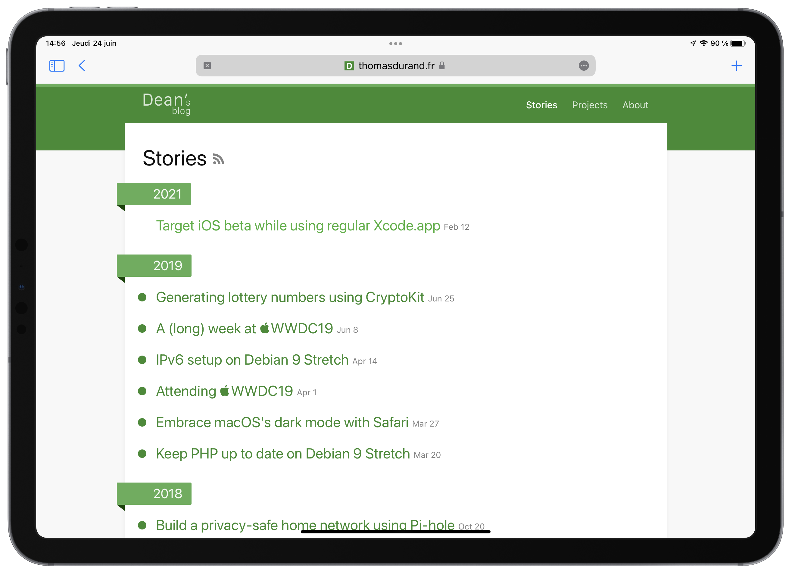
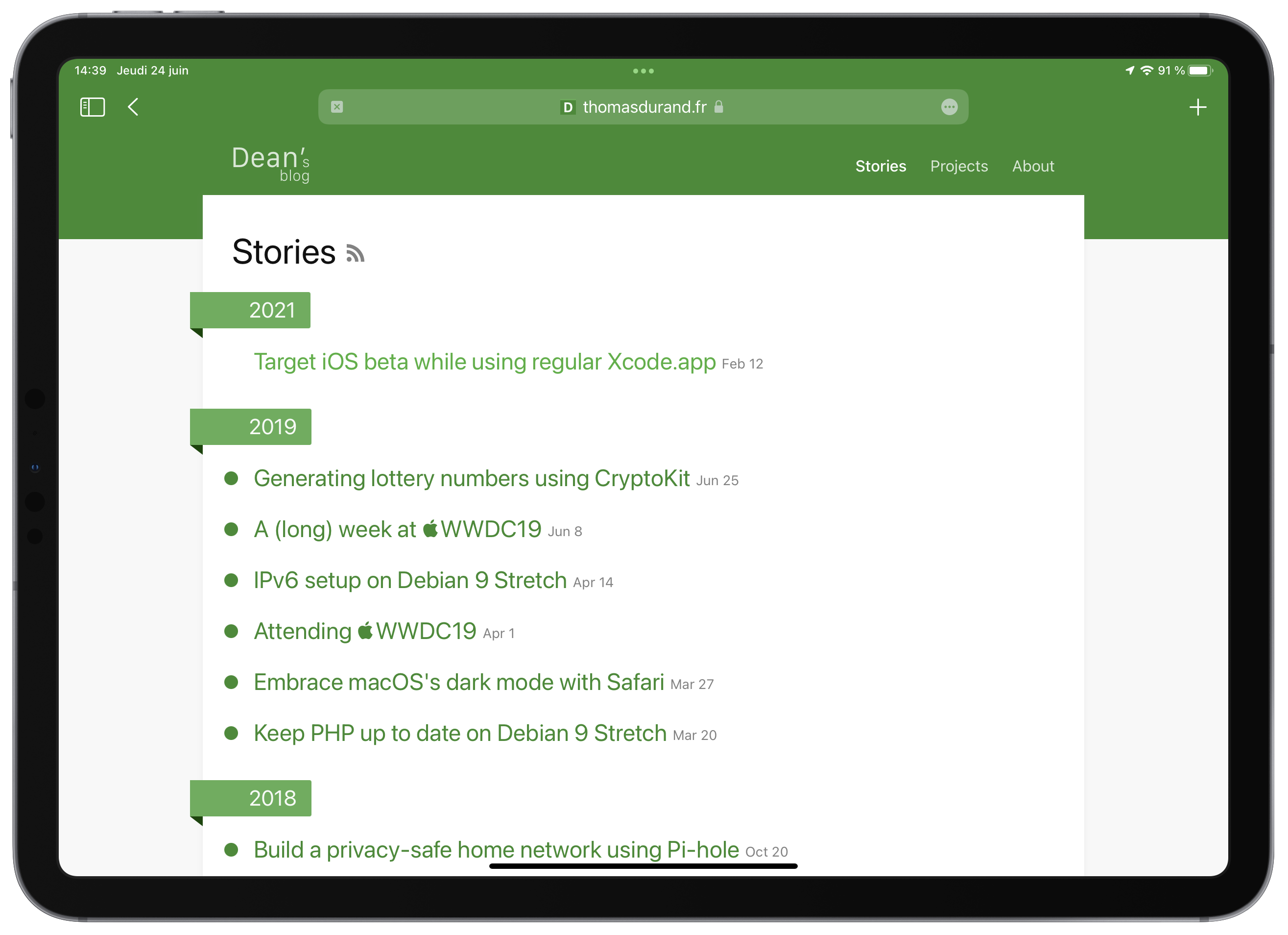
Maybe the algorithm responsible for choosing the color is not yet completed, but there is a new <meta> tag property that we can use to help Safari understand our design.
<meta name="theme-color" content="#378b2e">If your website requires different colors for light & dark theme, you might also add variants:
<!-- The first one will be the default for when the color-scheme is not defined. -->
<!-- If your website is dark by default and provide light as an alternative, put the dark first -->
<meta name="theme-color" content="#378b2e" media="(prefers-color-scheme: light)">
<meta name="theme-color" content="#074500" media="(prefers-color-scheme: dark)">
Also, to modernize the result, I decided to drop completely the top and bottom borders on my website header, providing this effect where the website and the browser makes only one.
Adapting CSS to support iPhone notch
As a matter of fact, I never adapted this blog to be aware of Safe Area; and notch.
The main reason is that I only got my first notched device since last November, and never tested it before. Even tools that helps design for devices like Safari “adaptation mode” will not make the notch nor safe area simulated.
Of course, when I tried landscape mode on iPhone, I was disappointed by the look my blog took:
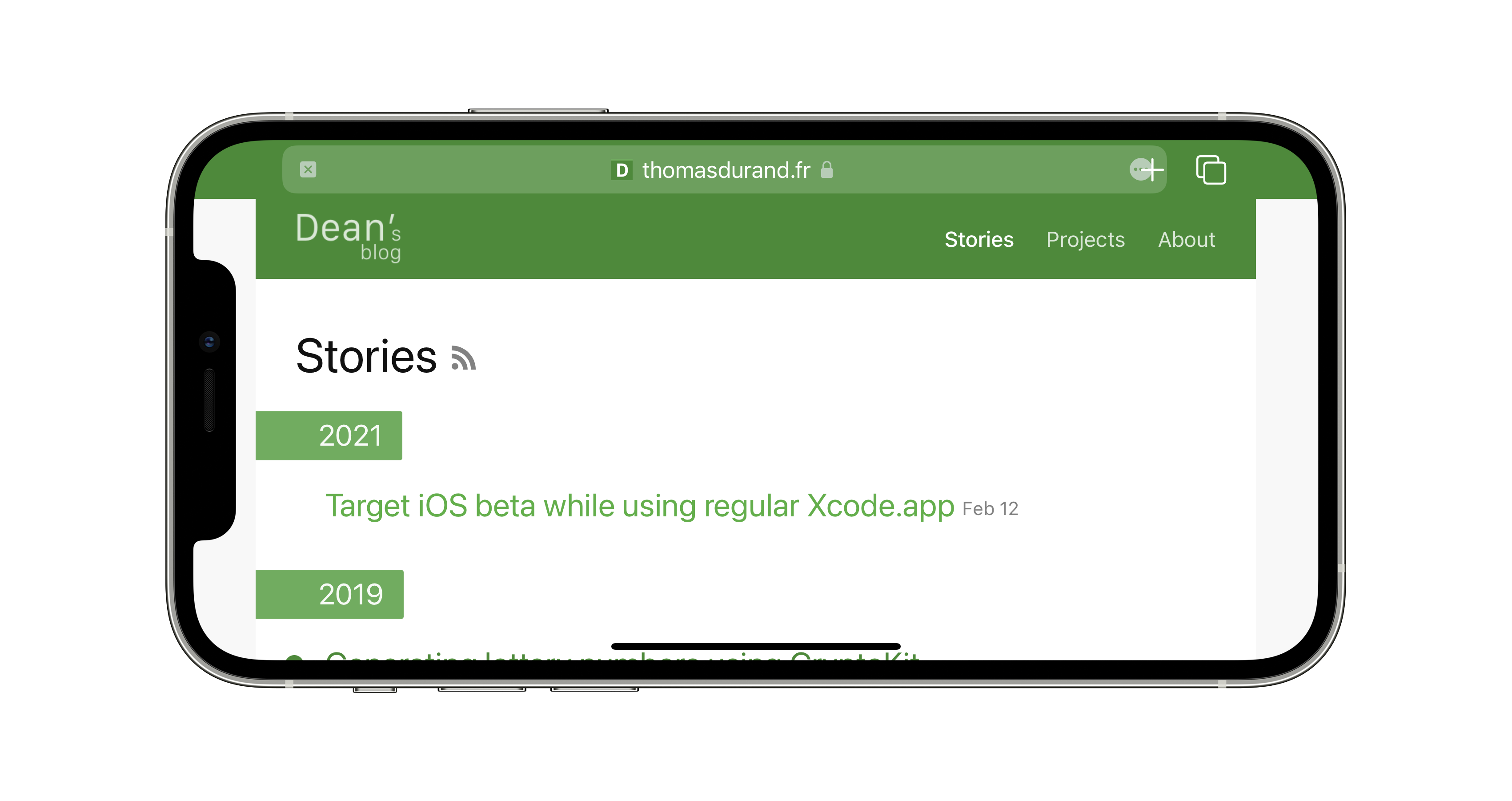
Safe area here is far from ideal
For the newest Safari, only the bottom safe-area matters, to take into account the new floating bottom bar:
.site-footer {
    margin-bottom: env(safe-area-inset-bottom)
}
But to also improve landscape mode for iPhone, I declared that my website could go behind the notch by adding viewport-fit: cover to my viewport meta tag.
<meta name="viewport" content="width=device-width, initial-scale=1, viewport-fit=cover">It is now my responsibility to use env(safe-area-inset-{left|right}) to prevent the content from going behind the notch.
.wrapper {
    padding-left: env(safe-area-inset-left);
    padding-right: env(safe-area-inset-right);
}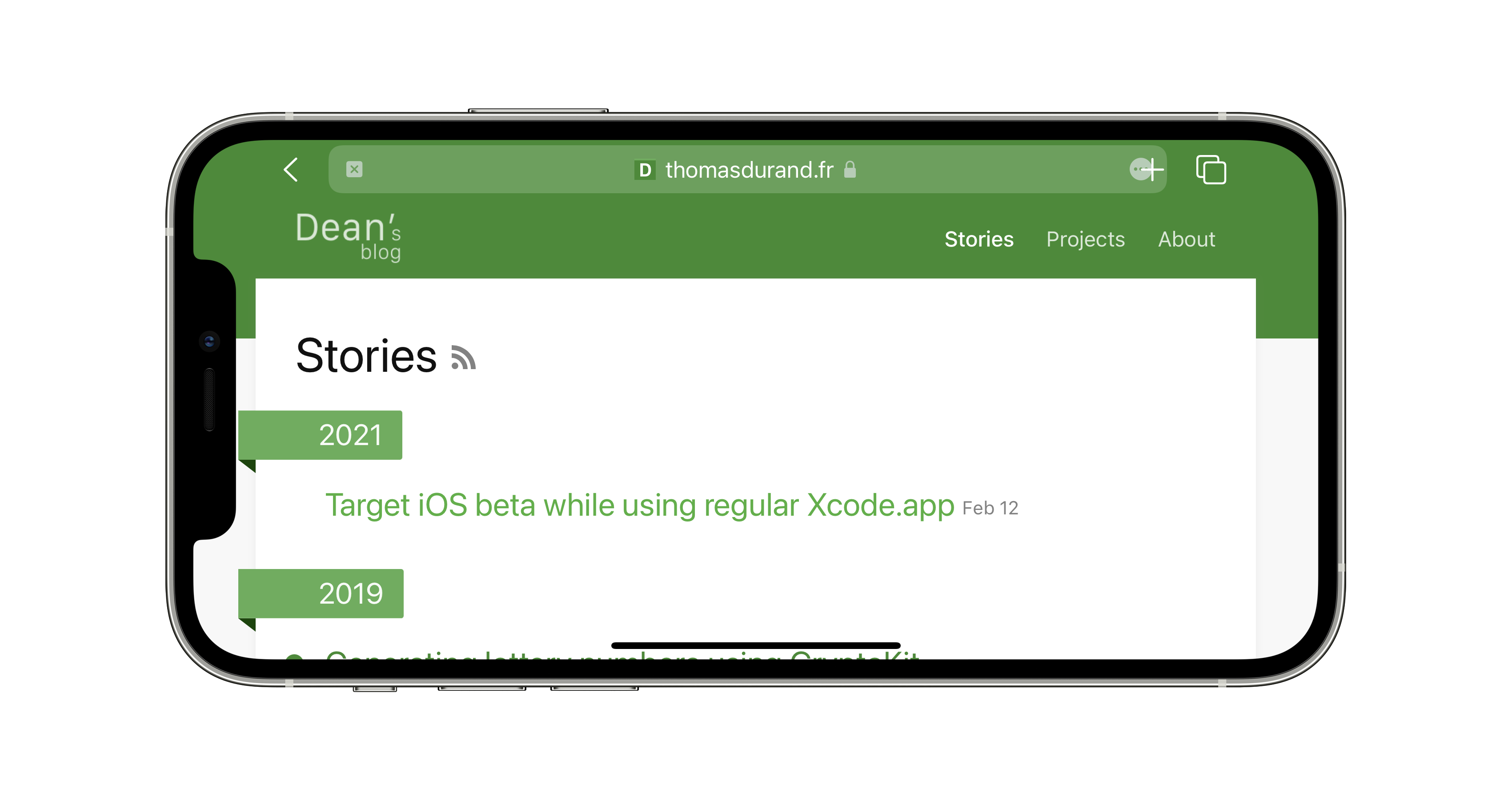
Perfection!
And now we have a perfect aspect for iOS and iPadOS devices!
Don’t miss a thing!
Don't miss any of my indie dev stories, app updates, or upcoming creations!
Stay in the loop and be the first to experience my apps, betas and stories of my indie journey.